Rows and Columns in Website Builder
Info: This article applies to Website Builder purchases made before 14th January 2025. For further assistance, please contact our support team.
Websites built in our Website Builder are constructed using rows and columns. But what exactly do we mean when we say that?
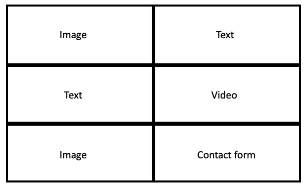
Imagine a table or grid layout, like a spreadsheet. There are rows going horizontally across the page and columns going vertically down the page. A typical structure is below.
Let’s use our Dental Clinic template as an example. This is divided into rows and columns as follows:

The top row is composed of three columns, with some text and a button in the left column, two small images in the centre column and a large image in the right column.
The centre row has no columns and consists of just a heading in the centre of the screen.
The third row is divided into three columns, with an icon, text and button in each one.
Why use rows and columns in a website?
When you build your website, if you structure the website using rows and columns, it helps to align all of the content elements. Text and images are placed in a consistent manner throughout the design, giving a clear visual style across the whole website. What’s more, the rows and columns automatically resize to adjust to the size of the screen being used to view them.
If you create your website using two columns positioned side by side in a row, when this is viewed on a large computer monitor (desktop), they will be positioned side by side. If you view the same website from on a phone it will present the same content as two rows. Having a website that looks great on a computer and a mobile phone is something thats really easy to achieve with our Website Builder.
Tip: If you want a great website but just don’t have the time to build one, why not talk to our Studio Team. We can build and maintain your website for you and bring your idea to life.